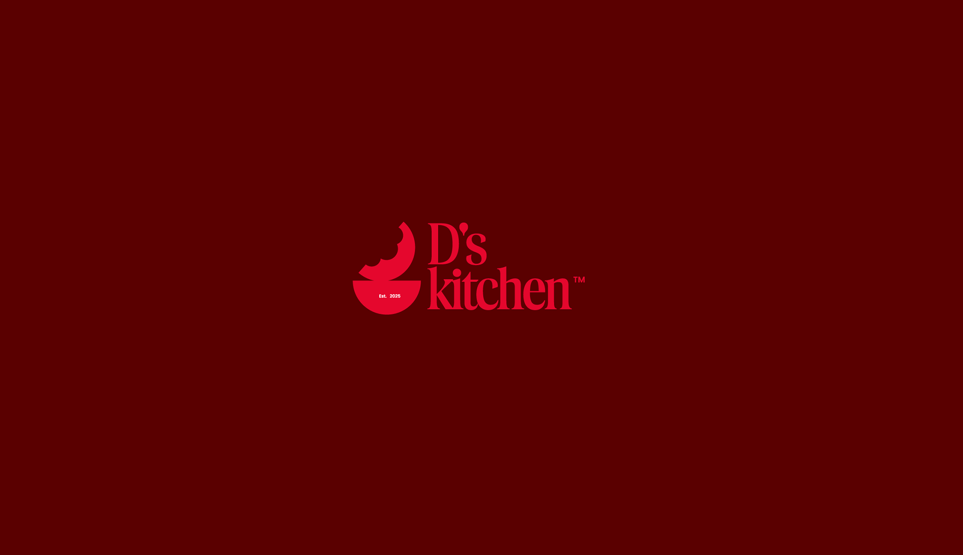
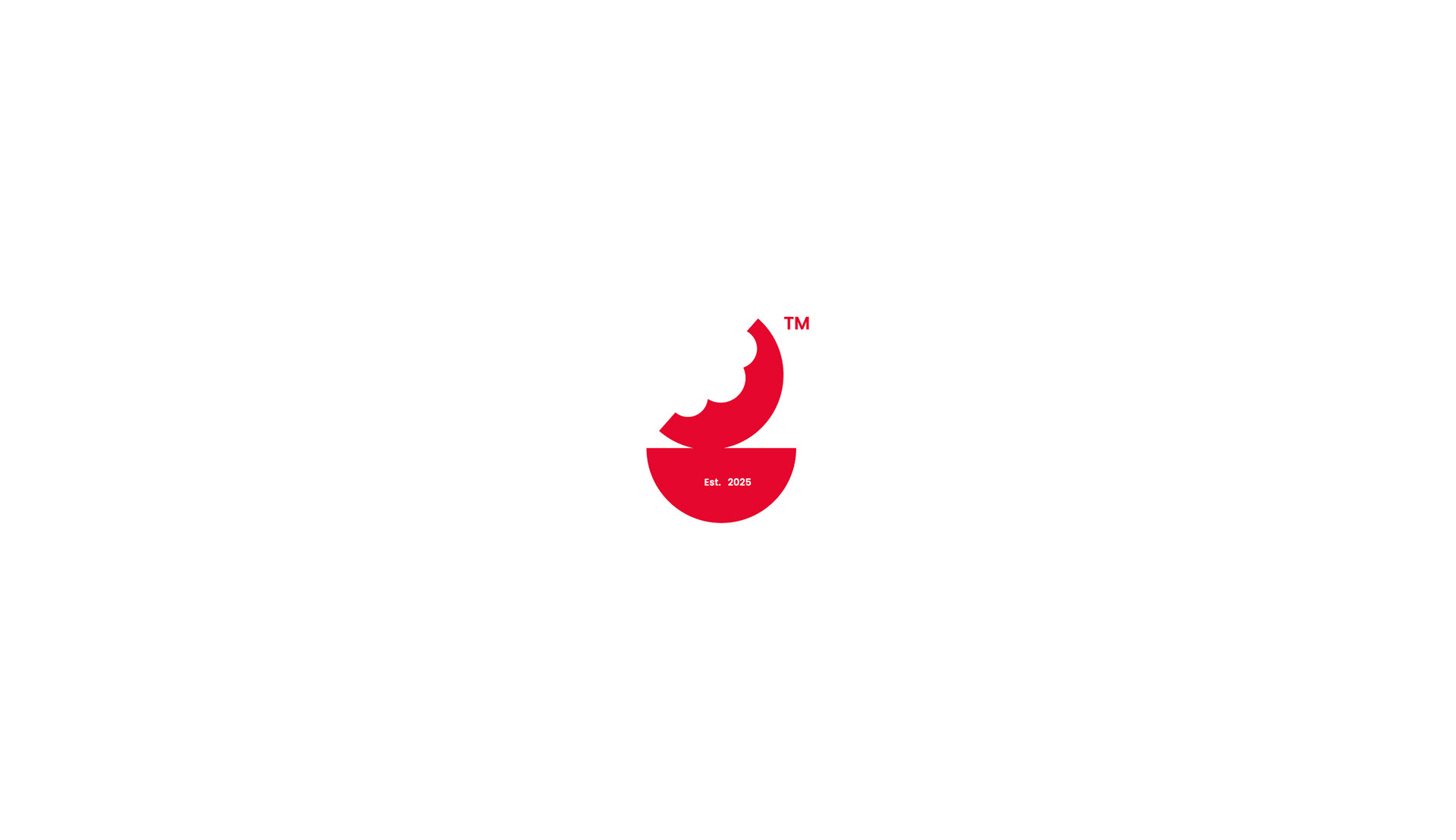
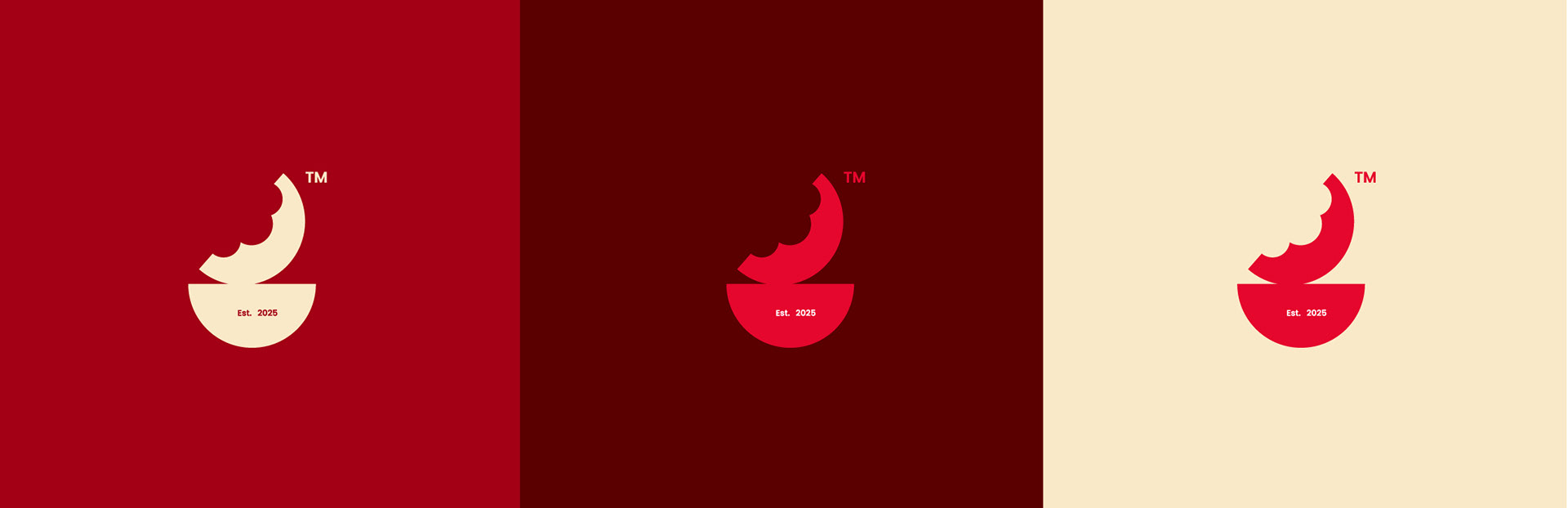
The chosen direction for D’s Kitchen was built around the idea of creating a bold, memorable, and appetite-driven identity that instantly connects with food culture in a modern and playful way. The logo combines a minimal bowl symbol with a bite-shaped form, creating a visual cue that represents satisfaction, flavor, and the irresistible experience of comfort food.
The typography balances elegance with personality, giving the brand a contemporary yet approachable character that works across packaging, signage, delivery apps, and digital platforms. The vibrant red color was intentionally selected to stimulate appetite, energy, and excitement while helping the brand stand out in competitive food environments.
The overall identity was designed to feel simple, recognizable, and scalable, positioning D’s Kitchen as a modern food destination with a strong visual presence and a memorable brand experience.